CSS : Cascading Style Sheets
- https://developer.mozilla.org/en-US/docs/Learn/CSS/First_steps/What_is_CSS
- https://web.dev/learn/css
- https://reactnative.dev/docs/flexbox
- https://maintainablecss.com/chapters/introduction/
- W3C Spec: https://www.w3.org/Style/CSS/ --> Use to go deeper
- https://every-layout.dev/ --> TODO: interesting book by an author of web.dev CSS
- https://www.joshwcomeau.com/css/understanding-layout-algorithms/ --> TODO: Mental model shift on CSS
- https://web.archive.org/web/20160329134901/http://isobar-idev.github.io/code-standards/#css_css
CSS Games:
What is CSS?
- Language for specifying how documents are presented to users (styles, layouts, etc.)
I have already learnt about these things in Teaser, but I want to learn more about them.
- Box model
- Cascade
- Specificity
- Flexbox
- Grid
- Z-Index
ISOBAR best practices
What should our CSS do?
- Be easily maintainable
- Follow clear patterns to understand
- Offer clear place for new styles going forward
- Not a drag on performance
- Not include unused style rules
- Address different devices, browsers, etc. with minimal code
What should be consider when setting up CSS?
- What are the default styles on our supported browser(s)
- What styles are global vs one-off
- Distinctions for code for layout vs content
- How the code will evolve
- Potential impact of bug fixes
- Use of images as CSS bg images vs inline HTML (content)
Before starting:
- Review the design
- Plan around technical constraints
- Identify how content will be managed
- Be certain who will be able to modify the design directly via code
- Segment the code logically
- Separate page grids & containers from the content
- Create baseline components which are extendable
- What are baseline components?
- Core brand styles
- Basic typograph & default HTML rules
- Site-wide styles
- Distinct sections of a site
- Micro-sites & landing pages
- Components, widgets or re-usable modules
Same as HTML, consider whether you really need it before adopting third party CSS components or frameworks
Establishing CSS Conventions:
- Keep your code consistent
- Formatting, Linting, naming conventions, file structure, example code, guide for component reuse
- For large sites, don't use a single stylesheet!
- Can use CSS preprocessors to break style sheets into smaller and better organised files (and build process to recombine them for performance when serving)
- Living style guides: Keep your style guide updated
CSS Best Practices:
- Inclusion: Use the
<link>tag to include all stylesheets in<head>- Don't use
@importfor best performance as this blocks page rendering until completion
- Don't use
- Formatting rules:
- New line for each selector / declaration
- Single space between the opening brace
{ - Lowercase for elements and shorthand hex values
#aaa - Hyphenate class selector names (avoid snake_case and camelCase)
- Quote attribute values in selectors
- Use one-level indentation for each declaration
- The closing brace goes in the same column as the first character of a set of rules
- Use a single blank line between rules
- Inside sets of rules:
prop: valueuse a single space to separate- Double quotes for quoted values
- Always use a semicolon at the end of the last declaration
- Use shorthand when possible
- Use
0without units when allowed
- Don't indent child styles
- Reasons: hinders maintainability, we use indents for media queries, structure frequently changes
- Specificity: Minimum specificity to achieve the desired style
- Don't use
!important(IT'S THE NUCLEAR OPTION) idselector should be minimised (could useclassinstead which is a lower specificity)- id selectors should be mainly used as access points for JS
- Don't use
- Vendor prefixes: When using vendor prefixed features, put the standardized rule at the end to ensure browsers optimize and use the standard if they recognize it.
- Inline styling: Don't hard code into HTML markup (pref use
.cssstylesheet)- performance loss is minimal
- Usage of
box-sizing: border-box: TODO:
CSS Coding Patterns: Consider what components can be standardized
- Global defaults: Baseline HTML elements (keep these in their own baseline stylesheet)
- Page level rules: Grids for page layout can probably go in their own file
- Components: Related objects on a page. Can encapsulate these in distinct files by grouping them in a simple namespace like prefix-suffix-modifier type pattern
- Examples where this pattern might be useful: navbar, footer, page-info, article-date, lead, widgetfoo, byline
- Modifiers: Extend existing components by creating distinct modifier classes with the prefix
mod--> indicates this is a modifier and not a complete style<div class="component-content mod-modifier-a">...</div>
- State: State rules will use the
is-prefix.component-group.is-full { ... }
- JS Prefixes:
js-executerule should not appear in CSS file but only the JS file they are tied to<button class="component-button js-execute">...</button>
- Utilities: Using the
u-prefix, utilities are a type of component modifier that is specifically designed to be used on more than one component type- should serve only the modifier purpose intended without side effects when applied to any component, or component descendant.
u-warning {...}
Example component "namespaces" / naming convention
/* core component */
.component { ... }

/* component elements */
.component-header { ... }
.component-content { ... }

/* component descendant */
.component-content-group { ... }

/* component descendant element */
.component-content-group-header { ... }
.component-content-group-imgs { ... }
Next Steps:
- Browser Compatibility
- Media Queries
- Accessibility and CSS
- CSS pre-processors usage
- Internet Explorer, or browser-specific bugs
- Usage of CSS3 transitions, transforms, and more
- Vendor prefixes
- Color Management
The Box Model
Intrinsic sizing: Fits to the size of the content. The browser makes decisions on sizing based on the box's content size.
Extrinsic sizing: There's a limit of how much content you can add before it overflows out of the element's bounds
When a piece of content is too large for the box it's in
The Box Model:
- Content box: Area the content lives in
- Padding box: Space surrounding the content box set by the
paddingproperty- Scrollbars will occupy this space with overflow rules such as
overflow: autooroverflow: scroll
- Scrollbars will occupy this space with overflow rules such as
- Border box: Space surrounding padding box set by the
borderproperty - Margin box: Space around your box set by the
marginproperty- Properties like
outlineandbox-shadowoccupy this space (they do not affect the size of the box itself)
- Properties like

How to debug the box model?
- Use browser devtools (inspect from the dropdown menu in chrome)
Controlling the box model:
CSS Syntax:
Example CSS rulesets:
/* element selector */
h1 {
  color: red;
  font-size: 5em;
}
/* class selector */
.exampleClassName  {
  color: blue;
}

/* id selector */
#idSelectorName {
  color: green;
}

/* attribute selector */
[data-type='primary'] {
  color: red;
}

/* descendant combinator */
li p  {
  color: green;
}

/* adjacent sibling combinator */
h1 + p {
  font-size: 200%;
}
- Selector: Rules open with selctors that select the HTML element to style (
h1in the example)- In the example above, we use an element/type selector (selects all
h1elements) - The class selector uses a
.on the class attribute specified in HTML - The id selector uses a
#on the id attribute specified in HTML - Can combine the selectors such as
h1.classNamewhich selects allh1elements with the class attribute "className" - Instruct CSS to look for attributes by wrapping the selector with square brackets
[ ].- Not including a value in the CSS rule looks for all elements containing that particular attribute regardless of value
- In the example above, we use an element/type selector (selects all
{}curly braces enclose the declarations- Declarations: Property and value pairs
- Property: Human readable identifyer indicating styling features
- Value: Value of the property indicating the style
- descendant combinator: Spaces between the selectors denote selection based on nesting. So you can style things based on their location in a document
- In the example,
li pselects allpelements that is a descendent of alielement
- In the example,
- adjacent sibling combinator: Use the
+symbol to style elements that come directly after anotherh1 + pstyles the<p>elements that come right after a<h1>element
Styles based on State:
a:link {
  color: blue;
}

a:visited {
  color: pink;
}

/* Your list will now either have red dots, or red numbers */
li::marker {
  color: red;
}

/* Style content highlighted by the user */
::selection {
  background: black;
  color: white;
}
- Psuedo-classes: Use the
:symbol to target styles based on the state of an element - Pseudo-element: keyword added to a selector that lets you style a specific part of the selected element using the
::symbol
CSS Matching:
- Apply regex rules to matching
- Use grouping selectors to group multiple selectors together
/* Case insensitive attribute selector */
[data-type='primary' s] {
  color: red;
}

/* A href that contains "example.com" */
[href*='example.com'] {
  color: red;
}

/* A href that starts with https */
[href^='https'] {
  color: green;
}

/* A href that ends with .com */
[href$='.com'] {
  color: blue;
}

/* Grouping selector applies a rule to all the following selectors */
strong,
em,
.my-class,
[lang] {
  color: red;
}

/* Universal selector */
* {}
How to add CSS:
- Link styles.css in the
<head>element using<link rel="stylesheet" href="styles.css" /> - Internal stylesheet: Add
<style>element (bad practice as can lead to inconsistencies imports, better to keep everything on a stylesheet) - Inline styles: Use style attribute such as
style="..."(bad practice same as internal stylesheets)
Comments: Use /* and end with */ to add comments
Rules in CSS
The cascade algorithm is split into 4 distinct stages.
- Position and order of appearance: the order of which your CSS rules appear
- Specificity: an algorithm which determines which CSS selector has the strongest match
- Origin: the order of when CSS appears and where it comes from, whether that is a browser style, CSS from a browser extension, or your authored CSS
- Importance: some CSS rules are weighted more heavily than others, especially with the !important rule type
Cascade Rule: The CSS rule that appears latest in the document replace conflicting styles that appear earlier in the stylesheet
Specificity Rule: There is an order of precendence between different types of selector
- This rule uses a point system by adding all the selectors together. So, if you combine multiple selectors such as
a.my-class.another-class[href]:hover, it will be really hard to overwrite this with other CSS (solution: KISS! Use simple CSS rules when possible) - Specificity selectors order (lowest to highest points)
- Universal selector: 0 points
- Elements, pseudo-element selectors: 1 point
- Class, pseudo-class or attribute selector: 10 points
- ID selector: 100 points
- Inline Style attribute: 1000 points
!importantrule: 10000 points
- E.G.
a[href="#]is worth 11 points (1 fromaelement selector + 10 fromhrefattribute selector)
| Specificity Category | Description | Example |
|---|---|---|
| Inline Styles | Styles directly on the element using the style attribute. | <div style="..."> |
| IDs | Selectors using the ID of an element. | #someId |
| Classes, Attributes & Pseudo-classes | Selectors based on class, attribute or pseudo-class. | .someClass, [type="text"], :hover |
| Elements & Pseudo-elements | Selectors based on element name or pseudo-element. | h1, ::before |
How do I verify my CSS rules are working as intended?
- Use your browser DevTools (rule will be crossed out if it waas overridden)
@rules: Provide instruction for what CSS should perform or how it should behave
@import: imports another stylesheet into your stylesheet@media: Create media queries that use conditional logic for applying CSS styles
E.G. Define a blue background if the browser viewport is wider than 30em
@media (min-width: 30em) {
  body {
    background-color: blue;
  }
}
Functions in CSS
calc: Do simple math
.box {
  width: calc(90% - 30px);
}
transform functions: Apply transformations to elements
- Values of the attribute
transform
.box {
  margin: 30px;
  width: 100px;
  height: 100px;
  background-color: rebeccapurple;
  transform: rotate(0.8turn);
}
CSS Inheritance
CSS inherits rules (rules cascade down)
- every HTML element has every CSS property defined by a default value
- If the parent HTML element has a inheritable CSS property set, the children will inherit the property's values
How do you explicitly inherit and control inheritance?
inheritkeyword to inherit rules from parent elementsinitial: Reset to default valueunset: If the property is inheritable this is the same asinherit, otherwise equalt oinitial. Useful because some properties are not inheritable
Colours (color property)
Colour codes are a hexadecimal #XXXXXX or #XXXXXXXX (last two hex values are opacity with 8 length hex string)
Define RBG colours with rgb() color function
- Can use [0, 255] or [0%, 100%]
- Add alpha channel with
rgba()
HSL: Hue, Saturation, Lightness with hsl() function
- Can use [0deg, 360deg] or [0%, 100%]

Colours can also have keywords such as rebeccapurple
Units in CSS
ch unit: CSS value that allows you to control the size of text based on it's actual contextual size
chis based on the width of a0character
E.G: Limiting the width of a line to 70 characters
p {
  font-size: 1.25rem;
  max-width: 70ch;
}
Usage of unitless numbers: For css properties like line-height, using unitless numbers indicates a ratio
- Bettter to use a unitless value for properties with ratios like
line-height: 1.5becausefont-sizecan be inherited and thus defining a unitlessline-heightadjusts the line height relative to thefont-size - What properties use ratios when the value is a unitless number?
- Filter, opacity, some transform functions, etc.
Usage of percentages: How are percentages calculated?
width,marginorpadding: Percentage of the parent's width regardless of direction
Dimensions: Attaching a unit to a number makes it a dimension.
- Lengths are dimensions that refer to distance
- Absolute length: Lengths revolving around a fixed base value
cm,mm,Q(Quarter-millimeters),in(inches)pc(Pica: 1/6 of an inch)pt(Point: 1/72th of an inch)px(Pixel: 1/96th of an inch)
- Relative Length: Lengths revolving around a resizable base value (relative lengths are like percentages)
- Relative to font-size:
em: Relative to current font sizeex: Height of the letter "x" == 0.5emcap: Height of capital lettersch: Relative to the width of the "0"ic,rem,lh,rlh
- Relative to the viewport (browser window):
vw: 1% of viewport width (use to for resizing based on viewport width)vh: 1% of viewport height (^ for height)vi,vb,vmin,vmax
- Relative to font-size:
We saw angle units deg in HSL
- Can also use for rotation transforms
Resolution units like dpi: Use for serving up higher resolution images based on screen resolution
CSS Layouts
Before CSS was widely adopted in browsers, devs used HTML table elements to layout their HTML pages
- Nowadays,
flexboxandgridare used for layouts
display property: Determines whether an element is inline or block.
- Possible values are:
inline,blockorflex - Inline elements: Elements that sit next to each other on the same line when possible.
- Block elements: Elements that create a new line for themselves. Block elements expand to the size of the available inline dimension, spans the full width in a horizontal writing mode
display: flexmakes the box a block-level box, and also converts its children to flex items
Flexbox & Grid: Two different layout mechanisms that create layout rules for multiple elements
Flexbox Layout
Useful notes
- https://css-tricks.com/snippets/css/a-guide-to-flexbox/
- TODO: Add the helpful images on properties like
justify-contentto this doc.
- TODO: Add the helpful images on properties like
- https://reactnative.dev/docs/flexbox
- https://flexboxfroggy.com/ --> Nice game for learning flexbox layouts
What problem does a Flexbox Layout solve?
Flexbox is designed to provide a consistent layout on different screen sizes.
You will normally use a combination of flex-direction, align-items, and justify-content to achieve the right layout.
What is a Flexbox layout?
Flexbox is a layout mechanism for one-dimensional layouts.
flexdefines how your items are going to fill the available space along your mail axisflex-directioncontrols the direction in which the children of the node are laid out. Sets the main axis. The cross axis is perpendicular to the main axis.- Note: flex-direction is purely visual and setting this to
row-reverse/column-reversemay have negative consequences
- Note: flex-direction is purely visual and setting this to
justify-contentdescribes how to align children within the main axis of their container.- Align children
flex-start,flex-end,center,space-between,space-around,space-evenly - justify-content property values
- Align children
align-itemsdescribes how to align children within the cross axis of their container.align-content: determines the spacing between lines
justify-self/align-self: Apply to individual items- Items stay on the same axis
What is flex-wrap?
Flexbox doesn't wrap items unless you specify it (single line by default). flex-wrap will cause items to be wrapped into multiple lines along the main axis if required.
wrapornowrapdefault.
Flexbox shortcuts:
flex:can take up to three argumentsflex-grow flex-shrink flex-basis. Recommended you use this shorthand instead of setting each individual property- Initial values are:
flex-grow: 0: Items do not grow --> Proportion of space in the flexbox the item takes upflex-shrink: 1: Items can shrink smaller than theirflex-basisflex-basis: auto: Items have a base size ofauto
flex-flowis a shorthand for combiningflex-directionandflex-wrapplace-contentis a shorthand forjustify-contentandalign-items
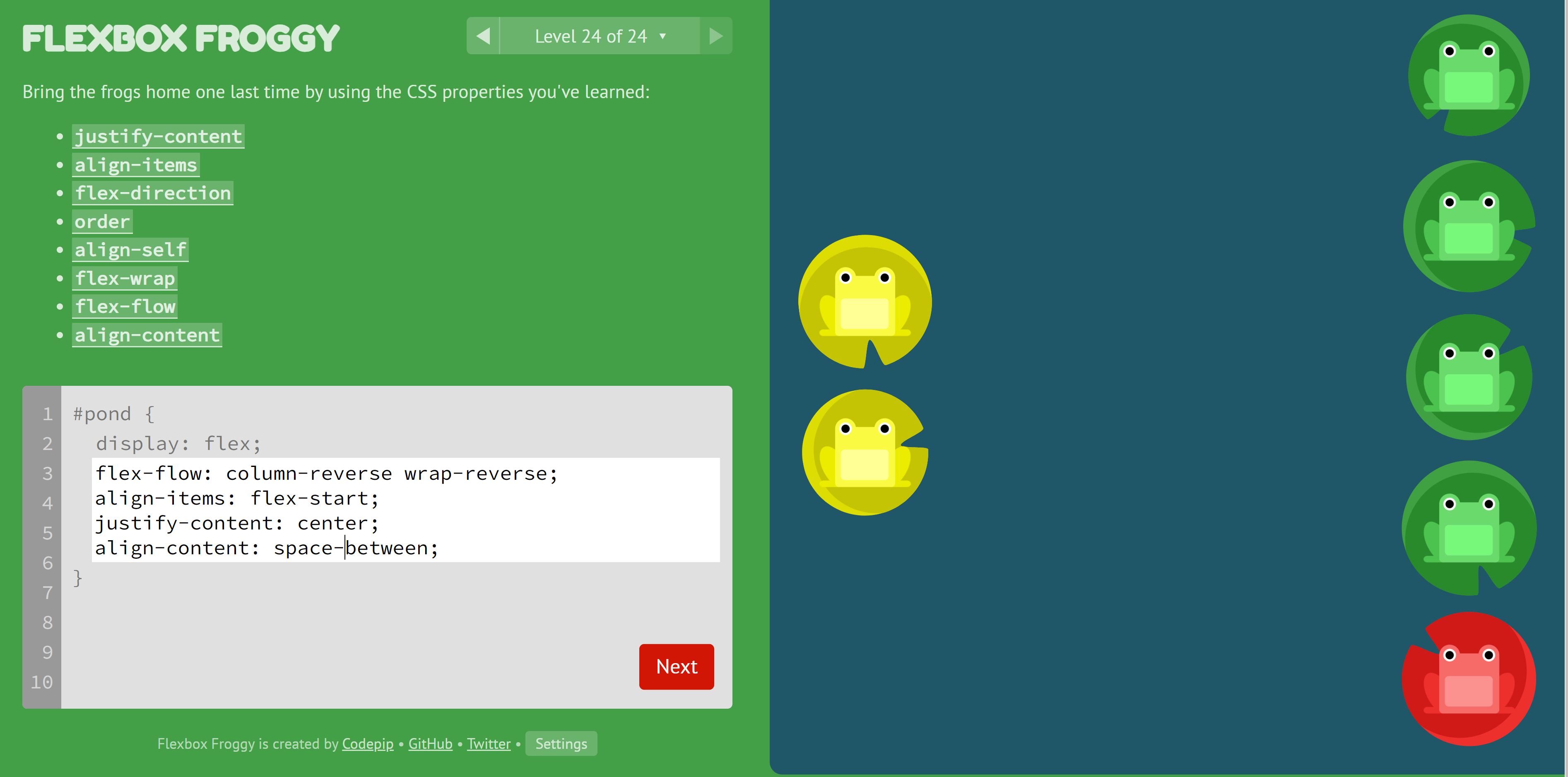
Grid garden example: Red/green frogs are together. Yellow frogs are together.
flex-flow: Sets flex-direction and wrap + wrap directionalign-items: flex-start causes frogs to hug the left border (because column-reverse flex-direction)justify-content: centers in middle of column (because column-reverse flex-direction)align-content: space-between causes items to be evenly distributed in the line; with the first item on the start line, and last item on the end line
Grid Layout
Useful notes
- https://css-tricks.com/snippets/css/complete-guide-grid/
- TODO: Add the images on properties like
- https://cssgridgarden.com/ --> Really fun CSS grid layout game
What problem does a Grid Layout solve?
Any two-dimensional grid-based layout system! An example would be the Header, sidebar, content and footer layouts on a page.

What is a Grid layout?
Grid is similar to flexbox but designed to control multi-access layouts. Grid gives you precise control of items in two dimensions
Defined by display: grid on the container.
Important CSS Grid terminology:
- Grid container: Element on which
display: gridis aplied. Direct parent of all grid items - Grid item: Descendent of grid container
- Grid line: Dividing line that makes up the structure of the grid.
- Grid cell: a single “unit” of the grid
- Grid track: Space between two lines --> A whole row or column of grid cells
- Grid area: Total space surrounded by four grid lines. An rectangular area inside the grid of units
Grid Container properties:
display: grid: how you define the element as a containergrid-template-columns/grid-template-rows: Define the columns and rows of the grid with a space separated list of values. Values represent track size, and space between them represents the grid line- You can name grid lines
- track size: Accept values are
%, length orfrfraction of the free spacefrworks the same as a flex unit- If the other units are pixels, percentages or ems, columns set with
frwill fit the remaining space. Useful for taking up the rest of the space when you have fixed components
- If the other units are pixels, percentages or ems, columns set with
- Intrinsic sizing keywords: keywords designed in box sizing spec to add additional ways of sizing boxes in CSS
min-content: Make track as small as possible without overflow- longest word or image
max-content: Make track wide enough to display in one unbroken string (causes overflow if wrap is not enabled)- longest sentence or biggest image
fit-content(): max-content but wraps once it passes the passed in threshold
minmax()Set min and max size of a trackrepeat(): Use to repeat any section of your track listingauto-fill: auto-fill FILLS the row with as many columns as it can fit. These cell may be empty / not defined in HTML!auto-fitfits the AVAILABLE cells to the space.- Use
repeat(auto-fill, 200px);orrepeat(auto-fit, 200px);to repeat as many fixed-length grid cells as will fit in the track - If there is a <200px gap due to viewport size, it will not be filled. Add
minmax(*, 1fr)such asrepeat(auto-fill, minmax(200px, 1fr));to divy the remaining area between the cells
Example grid:
.container {
    display: grid;
    grid-template-columns:
      [main-start aside-start] 1fr
      [aside-end content-start] 2fr
      [content-end main-end]; /* a two column layout */
}

.sidebar {
    grid-column: aside-start / aside-end;
    /* placed between line 1 and 2*/
}

footer {
    grid-column: main-start / main-end;
    /* right across the layout from line 1 to line 3*/
}
Auto-placement: How to control the placement of items in a grid
grid-auto-flowcontrols whether the placement is in rows or columnswriting-modeis for other languages basically (think japanese with vertical characters or arabic rtl)grid-column-end/grid-row-end: Cause elements to span multiple tracks using thespankeyword on an item- Can specify the
grid-column-start/grid-row-start- Goes from
grid-column-start-->grid-column-end - Either value is can be an index or a span from the other value
grid-column-endis non-inclusive- Both can have negative values
- Goes from
- Values are the starting / ending lines (can double check lines with devTools)
- Use shorthands
grid-column: start-col / end-col. Works withgrid-rowtoospan& negatives also works with grid-column/rowgrid-areais yet another shorthand with syntax:grid-row-start,grid-column-start,grid-row-end, followed bygrid-column-end.
- Can specify the
Placing items
- Stack items using
z-index - Items are ordered smallest to largest [-inf, inf]. Change the
orderof items - Explicit Grid: Grid explicitly defined by css properties like
grid-template-rows - Implicit Grid: the browser automatically creates the necessary tracks when items are placed outside the explicitly defined grid (e.g. too many grid items overflows the grid)
- Use
grid-auto-rows/grid-auto-columnsto size implicit rows/columns
- Use
- Negative numbers: Using negative line numbers you can place items from the end line of the explicit grid.
- E.G. Sidebar spanning entire column track (first to last column line) using
grid-column: 1 / -1 - However, if there is an implicit grid (too many elements overflows the grid), then the sidebar will not span the implicit grid
- E.G. Sidebar spanning entire column track (first to last column line) using
Grid Template Areas: Name areas of the grid and place items into the named areas
- use the
grid-areaproperty to give direct children a name - Use the
grid-template-areasproperty to define which grid cells each item will span- No empty cells allowed
- Span tracks by repeating the name
- Areas created must be rectangular and not disconnected
.for whitespace
- Why? If the entire layout is defined in one place, it's much easier to understand
Example using the grid-template-areas property
header {
    grid-area: header;
}
.sidebar {
    grid-area: sidebar;
}
.content {
    grid-area: content;
}
footer {
    grid-area: footer;
}

.container {
    display: grid;
    grid-template-columns: repeat(4,1fr);
    grid-template-areas:
        "header header header header"
        "sidebar content content content"
        "sidebar footer footer footer";
}
Debugging the Grid:
- Open DevTools
- Select
gridbadge next to grid container in the element selector - Goto layout tab
List of shorthand properties
grid-template:grid-template-rows/grid-template-columns/grid-template-areasgrid:grid-template-rowsgrid-template-columnsgrid-template-areasgrid-auto-rowsgrid-auto-columnsgrid-auto-flowgrid-column:grid-column-startgrid-column-end- Same for grid-row
grid-area:grid-row-startgrid-column-startgrid-row-endgrid-column-end
Grids use the same alignment properties as flexbox.
justify-contentandalign-content: distribute additional space in the grid container around or between tracks.justify-selfandalign-self: are applied to a grid item to move it around inside the grid area it is placed in.- This causes
background-colorto fill the grid area as they default to stretch
- This causes
justify-itemsandalign-items: are applied to the grid container to set all of the justify-self properties on the items.
Normal Layout (Normal Flow)
If grid and flexbox are not being used, your elements display in normal flow.
- Normal Flow: Document flow is the arrangement of page elements, as defined by CSS positioning statements
display: inline-block: Respects block margin and padding but still flows inline with the textfloatproperty: Wrap text around images with valuesleft,rightorinheritcolumn-countproperty in lists: Use for multicolumn layout where the content at the end of one column flows into the next columnpositionproperty: How an element is positioned in the normal flow and relative to othersrelative: positioned relative to itself and also makes it the containing block of any child elements withposition: absolute(children repositioned relative to this element).absolute: breaks the element out of the current document flow- Can position elements anywhere you want such as using
top,bottom,left,rightin it's nearest relative parent (root element is also relative) - All of the content surrounding an absolute element reflows to fill the remaining space left by that element.
- Can position elements anywhere you want such as using
fixed: behaves in a similar way to absolute, with its parent being the root<html>elementsticky: Has the fixed aspects offixedand the more predictable document flow-honoring aspects ofrelative. When the viewport scrolls past the element, it stays anchored to thetop,bottom,left,rightvalues- E.G. Use this for sticky sidebar elements that follow the page when scrolling
static: Default value
Maintainable CSS
Honestly, I don't know how useful this is. Just read it and jotted it down. Use with care!
Semantic class names: Name something based on what it is
/* Good */
<div class="hero">
  <h1 class="hero-title">Heading</h1>
  <p class="hero-tagline">Tagline</p>
</div>

/* Bad */
<div class="pb3 pb4-ns pt4 pt5-ns mt4 black-70 fl-l w-50-l">
  <h1 class="f4 fw6 f1-ns lh-title measure mt0">Heading</h1>
  <p class="f5 f4-ns fw4 b measure dib-m lh-copy">Tagline</p>
</div>
Use an ID when:
- There's only one instance of a thing
- You need to enable particular behaviours for browsers
- Avoid using ids as a hook style --> Probably better to just use a class with one object instead
CSS Conventions: .<module>[-<component>][-<state>] {}
What is a CSS Module?
- Module: Distinct, independent unit that can be combined with others to form a more complex structure.
- If a component is shared, consider "upgrading it" to a module by specifying the common rules together
- Specific styling features that are not shared can be applied directly
Example shared rules and differences
.basket-removeButton,
.another-loginButton,
.another-deleteButton {
  background-color: green;
  padding: 10px;
  color: #fff;
}

.basket-removeButton {
  float: right;
}

.another-deleteButton {
  margin-bottom: 10px;
}
Modifiers: Denoted by className--modifier are useful as an alternative to modules (or components) when they only have small and well understood differences
- E.G. Primary / secondary button style
Example modifier usage
<div class="categoryHeader categoryHeader--boys">
<div class="categoryHeader categoryHeader--girls">
.categoryHeader {
  padding-top: 50px;
  padding-bottom: 50px;
  /* etc */
}

.categoryHeader--boys {
  background-image: url(/path/to/boys.jpg);
}

.categoryHeader--girls {
  background-image: url(/path/to/girls.jpg);
}
How to organize your CSS into folders?
- Put it all into a single folder
- Put it into a module folder (folders based on feature)
Note: 31 CSS file limit in IE9
- Add compilation step with CSS preprocessor
Logical Properties
Logical properties refer to the edges of the box as they relate to the flow of content.
- Changes if text direction or writing mode changes
- Use logical properties to support internationalization
Logical property important characteristics?
- Block flow: Direction in which the content blocks are placed
- Inline flow: How text flows in a sentence. (changed by
writing-modeproperty) - Flow relative: Apply margin, padding relative to the flow of the document
- Using physical properties like
margin-topdmeans the margin is constantly applied to the top of the element even if the writing direction is changed. Ifmargin-block-startis applied, the margin will appear at the start of the text regardless of text direction or language
- Using physical properties like
- Sizing: Flow relative equivalent to sizing:
max-width->max-inline-sizemax-height->max-block-size
- Text align: Use
startandendinstead ofleftandright
Logical Property Equivalents:
/*equivalent works for borders, margin, etc*/
.my-element {
  padding-top: 2em;
  padding-bottom: 2em;
  margin-left: 2em;
  position: relative;
  top: 0.2em;
}

.my-element {
  padding-block-start: 2em;
  padding-block-end: 2em;
  margin-inline-start: 2em;
  position: relative;
  inset-block-start: 0.2em;
}
/*shorthand*/
.my-element {
  padding-block: 2em;
  margin-inline: 2em 0;
  position: relative;
  inset-block: 0.2em 0;
}
New Logical units:
vi: 1% of viewport size in the inline directionvb: !% of viewport size in the block direction
Spacing
Margin Collapse: Two adjoining vertical margins collapses to the size of the largest margin
- Can be prevented using
position: absoluteor thefloatproperty - applies to block elements
gap property in grid and flexbox: shorthand for row-gap and column-gap for space between elements